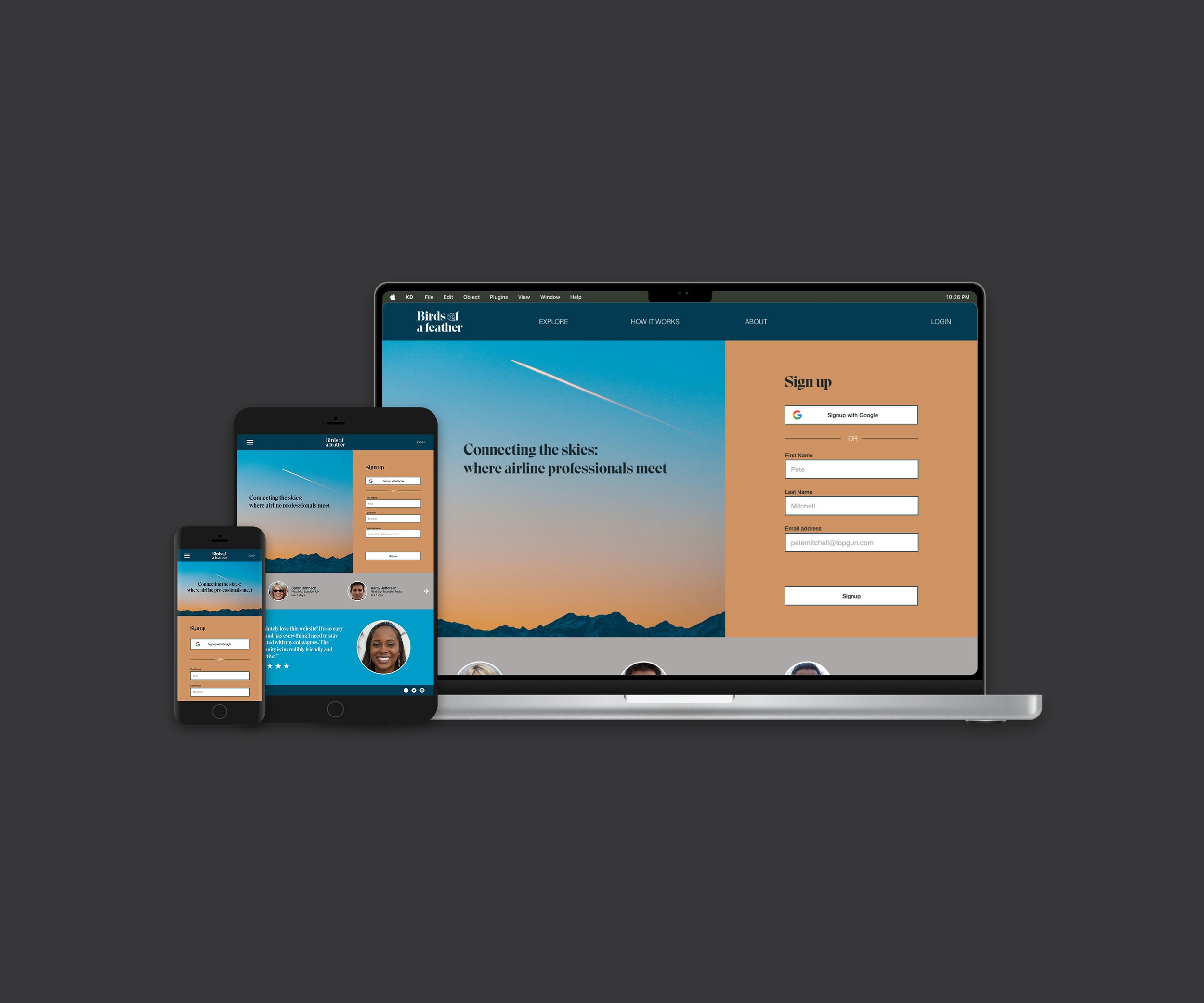
Birds of a Feather
Connecting airline professionals through a new social network
When: May 2022 - Jan 2023
Role: UX/UI Designer
Platform: Responsive webpage
The Problem: As airline professionals dart across the globe, jumping from city to city, they can feel alone and isolated with no means to connect with others who understand the struggles of their industry.
The Goal: Build a social media platform that allows airline professionals to connect and arrange meetups in cities worldwide.
Tools: Adobe XD | Pen + Paper | Miro | Zoom | Google Drive
Process: Empathise > Define > Ideate > Prototype > Test
click on links to jump to section
EMPATHISE
Understanding my target user
I began the process by interviewing 3 airline professionals, one pilot and two flight attendants and collating my findings into three empathy maps.
Questions
Which social media platforms do you use?
How often do you arrange to meet with other pilots when working?
What information do you feel is useful when organising to meet with other commercial pilots?
“I have a few friends who I like to meet up with but it’s near impossible to coordinate being in the same place at the same time.”
Key takeaways
Current social media offerings don’t fulfil the users’ needs
Airline professionals like to meet outside of work (while away from home) to socialise but coordination can be an issue
The airline industry can be very lonely when away from friends and family for extended periods of time.
To get an understanding of what products are currently available, I conducted a competitive analysis to identify where there may be an opportunity in the market. In my research, I found two near-direct competitors in We Fly Alone and VFR Pilots which look to build an airline professionals community online. For indirect competitors, I analysed the offerings from LinkedIn and Facebook. Full findings can be found here.
Key takeaways
There is a gap in the market for a social media platform exclusively for airline professionals
None of the current offerings have built-in functionality to share upcoming trips and destinations
The signup process of current platforms can be over complicated
Prioritising the work: problem statement
Many problem statements came out of my research. Given the time and resources at hand, I decided to focus on this problem first, specifically the signup process, and then approach the others once this initial problem is solved.
Ria is a commercial airline pilot who needs a way to easily connect with other pilots at her destination
because she wants to socialise with her colleagues.
From my research, I could construct a user persona that summarises the goals and frustrations of my target user.
DEFINE
What is the problem to be solved?
To ensure I am creating a smooth signup process, I did further research on the best practice approach.
According to a report by Heap, SaaS businesses can expect a drop-off of up to
64% on the signup form alone.
To decrease the drop-off rate of my signup process I followed the advice of Nathan J Powell’s research pull out a few best practice points to follow:
Keep it short, sweet, and non-threatening
Let people signup with existing platforms (e.g. Google)
Keep your fields in one column
Put labels above text input fields
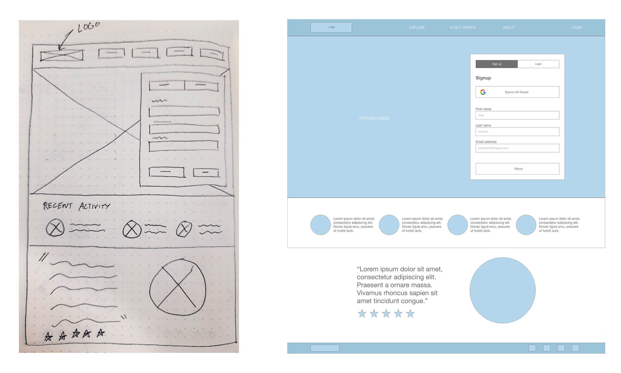
From this, I took the opening step of the signup process on the homepage creating paper sketches and then developing the best idea(s) a to low-fi wireframe.
IDEATE
How did I approach solving the problem?
Critiques of initial sketches
Signup should be prominent
Hero image takes up too much space at the top - not good for smaller screens
All signup options should be in one column to avoid confusion
Reviews and testimonies help to confirm product value to user - keep on landing page
To ensure a well-structured process, I planned the information architecture of the website - specifically looking at the signup process on the far left.
PROTOTYPE & TESTING
How does the user move through the signup process?
Building on my paper and lowfi wireframes, I created an interactive prototype of the signup process to test on my users from my original research (1 pilot, 2 airline professionals).
100% of participants completed the signup process in under 5 minutes
“In the airline industry, we don’t often use the full name of an airport, we generally prefer to use their codes.”
“I don’t think you need to know where your flight has come from if you’re just organising where to meet.”
How can I reduce the time taken to signup to the platform?
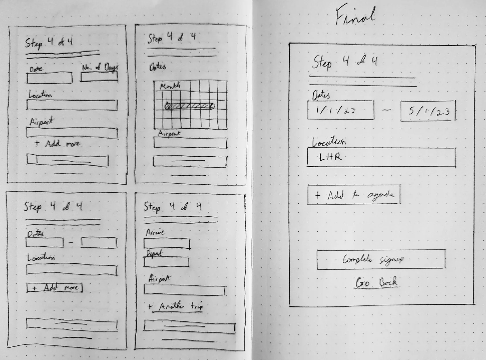
Observing the user testing and from their feedback, I found that users were slowing down at step four of the signup process. From the results, I decided to prioritise the two findings below with the goal of decreasing the duration of the signup to under 3 minutes.
Add in a database of three-character airport codes when inputting the location
Remove departure location information as not relevant when organising to meet up
From this I ideated how I could rework step 4 of the signup process based on the feedback from my participants and my two priority points.
In second phase of testing with the above amendment, 2/3 completed the signup in under 3 minutes.
DELIVERY
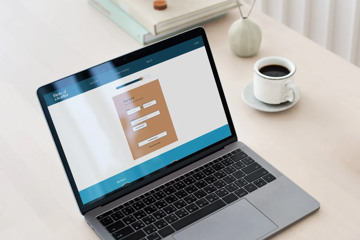
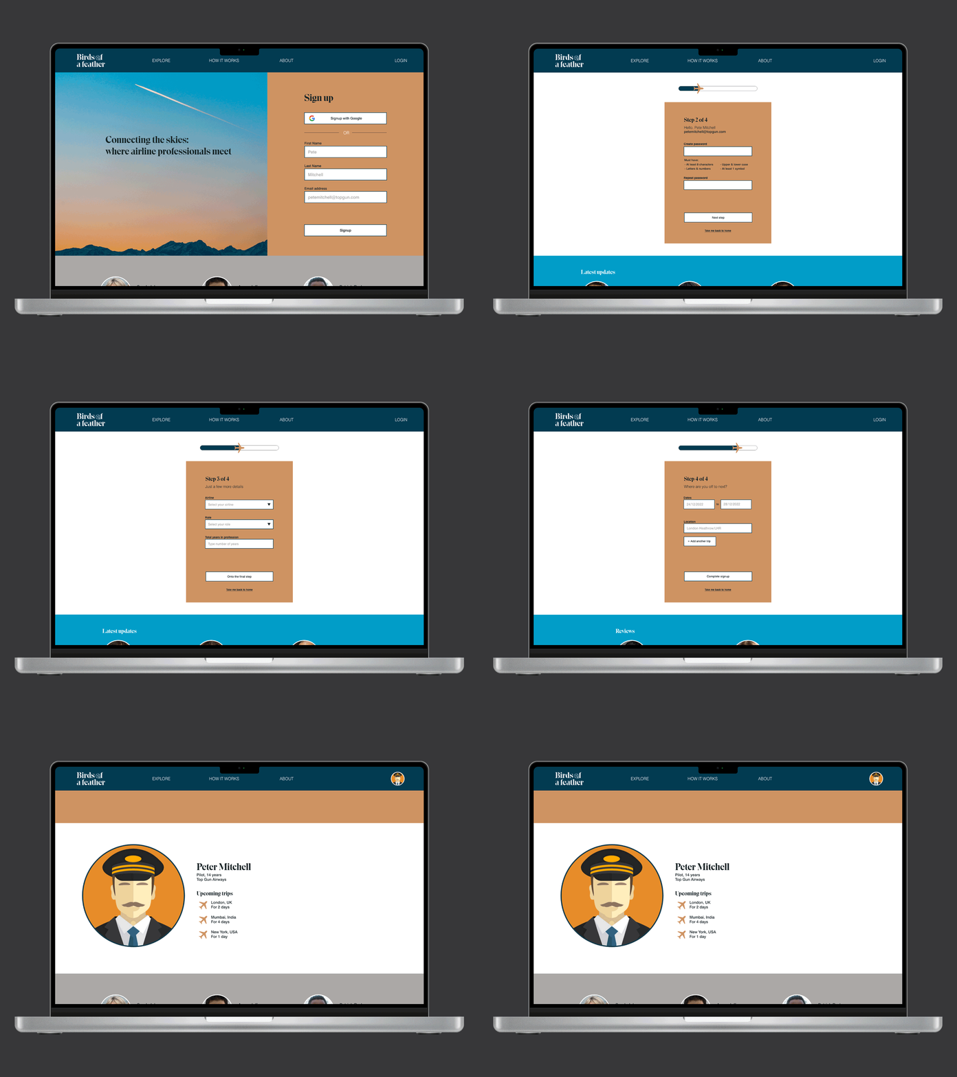
Birds of a Feather signup process
After validating all my concepts with users in usability tests, I was confident to keep on moving forward with the next stage.
Click to expand screens
LOOKING AHEAD
Next steps with Birds of a Feather
With the MVP of the signup process now built, the next step would be to continue to refine the designs and build out the rest of the platform. I will also start looking at the other points raised in my initial research to begin solving other problems presented.
Explore ‘incognito’ ability for those who don’t always want to socialise
Add in functionality to share photos on profiles
Build in hotel and restaurant recommendations


